After all, have you ever encountered an ugly flower? And, unlike the wallpaper or paint color that looked great in the store but now grates on your nerves, perennial plants can be moved and rearranged (and even given away) to suit your tastes. It’s easier, and more fun, than re-wallpapering!
You can find nearly every color of the spectrum in flowering perennials. Most people are drawn to certain colors, so if there is a color scheme you’ve admired—whether it is in a favorite sweater, upholstery, or garden—keep this in mind when choosing plants. Let’s take a look at some popular perennial plants, and see how different color combinations can set different moods.
Pastels: Soft pink, powder blue, lavender, and peach—these gentle colors set a mood of tranquility. They are the familiar colors of cottage gardens—informal gardens that contain a variety of old-fashioned flowers. Pastel colors look best when viewed from relatively close up, and they can looked washed out in the harsh mid-day sun.
 |
 |
 |
||
| ‘Autumn Joy’ Sedum |
‘Salmon Beauty’
Achillea |
‘Magic Fountain Pink’ Delphinium |
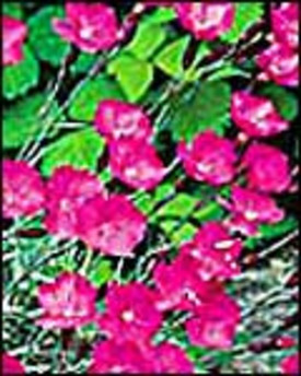
Brights: Racy reds, vibrant oranges, magenta, and sunny yellow—these colors invigorate and energize a garden. Bright colors hold up well to brilliant sunshine, and attract the eye even from a distance.
 |
 |
 |
||
| ‘Brilliant’ Oriental
Poppy |
‘Firewitch’ Carnation |
‘Gold Moss’ Sedum |
Complementary Colors: Colors that are opposite on the color wheel are described as complementary. High in contrast, complementary colors add creative energy and vitality to a garden. Yellow and violet are complementary colors; as are orange and blue, and green and red.
 |
 |
|
| ‘Early Sunrise’
Coreopsis |
‘Black Knight’
Delphinium |
Harmonious Colors: These are colors that are next to each other on the color wheel; examples include blue and violet, orange and red, and orange and yellow. These color combinations tend to be gentler on the eye than complementary colors. A harmonious color scheme unifies a garden, while allowing enough range of color that it doesn’t become monotonous.
 |
 |
|
| ‘Franz Schubert’
Phlox |
‘Blue Waterfall’
Campanula |
If you are concerned about your ability to choose colors, a harmonious color scheme might be a good starting point for you. Unlike complementary colors, which, if overdone, can seem jarring and can give a riotous feel to a garden, harmonious colors are a pretty safe bet. As you gain confidence in your design eye, you can always add splashes of a complementary color here and there to liven things up.
Monochromatic Color Scheme: You may have seen gardens composed of all white flowers, and indeed some of the world’s most famous gardens use a monochromatic color scheme. Instead of relying on different colored flowers, the gardener creates interest by mixing flowers of different sizes and shapes, and choosing foliage with interesting textures and colors. Perhaps you are partial to a single color such as yellow. You can create varying moods depending on whether you choose soft pale yellows, bright sunny yellows, or deep golden yellows. Or you might use a mix of shades.
 |
 |
 |
||
| ‘David’ Phlox |
‘Magic Fountain White’
Delphinium |
‘Itsaul White’
Carnation |
Credit: National Gardening Association