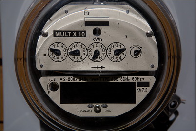
Speaking of comparing energy usage, the Department of Energy has two great maps featured on their website that lets you do just that, state by state.
One map shows how each state rates for energy consumption per person (based on 2009 figures), measured in Millions of BTUs per year.
The other map shows energy expenditure per person, per year, measured in dollars.
My “green” state of Vermont ranks 13th in the latter and 41st in the former. So we are consuming less energy than most but paying more than most for it. Hmmmm. I guess energy costs are pretty high here.
How does your state measure up?