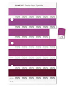
Pantone’s color system has informed and inspired countless industries for generations. From clothing designers, to home improvement experts to cosmetic manufacturers, Pantone’s singular approach to mixing and matching color has been the most influential in the world since the 1960’s. And so, in 2014 don’t be surprised if everything from tea pots to tank tops appear in their color choice of the year: Radiant Orchid.
Pantone’s deep-rooted influence begs the question: How do they go about choosing each year’s reigning color? According to Leatrice Eiseman, executive director of the Pantone Color Institute, the colors are intended to be both a reflection and expression of a global “Zeitgeist” (directly translated from German as “the ghost of the times”). Depending on what the color gurus see as the current state of affairs in the world is how they decide what color to promote. Coming on the heels of last year’s Emerald pick that was reportedly meant to symbolized growth, renewal and prosperity, Radiant Orchid “…inspires great joy, love and health.” Eiseman tells us. While some (especially economists) may argue that the need to continue on with last year’s principles is stronger than ever, few can deny that there is ever a bad time to affirm the qualities Radiant Orchid embodies.
While Radiant Orchid may, at first blush, appear to be a hue far too bold to be considered as anything more than an accent color – especially when part of a more traditional home decor scheme – it’s cool undertones makes it more versatile than one may think. The experts at Pantone recommend pairing it with neutrals like grey, beige and taupe to create a soothing, earthy atmosphere, and for a more vibrant look consider certain greens like olive and a deep hunter.
If you’re not a fan of this year’s pick, the next 365 days may be difficult, but as it always goes with color, it is best to try and keep an open mind. If you think you would never wear such a color, for example, try it just for fun. Radiant Orchid supposedly matches a wide range of skin tones, so it may be more flattering that you think. Likewise, if you are a color-phobe and have a home with wall-to-wall neutrals – especially those that coordinate and complement Radiant Orchid – grab a few throw pillows and see what happens. If you suddenly find your home full of joy and love, you will know why, when it comes to color, Pantone continues to be unmatched.